At 1000 words-a-piece, communicating with pictures is often the most effective way to convey an idea. Especially in the construction industry, I find myself relying on drawings to speak for me. They can't speak entirely for themselves, however, especially when they carrying your exact intention to someone who might interpret things differently than you. Contextual information is always needed, so the titleblock is a drafts-person's first way to frame whatever being communicated. With some serious freelance drafting work on my horizon, it was time to develop and some kind of titleblock.

While most companies have a standardized titleblock, I've never used one in while freelancing. I'm not really trying to be any particular "professional" entity, so I didn't need to incorporate any kind of "branding" or logo. I needed something simple and universal, but also wanted a more inherit logical structure. Since I don't do anything that requires large scale plotting, I sized the block to an ordinary letter size. I can use it on a tabloid size as well by just keeping it anchored in the lower right.

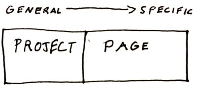
Across most types of projects, there's two kinds of information in the titleblock: general project information and notes specific to that page. I grouped these two main areas of the block headed by Project Name and Sheet Name. It's also standard practice to assign a number to each sheet in the lower right. From there it followed that data should get more specific as it moved towards that side of the page:
- Project Address > Drawing Author > Name and Phase of the Set > Revision info > Page #
Maybe I'm thinking too much about something so simple, and maybe it's not quite as elegant as I imagine. I like it, though, and I bet I'm going to get some use out of it.