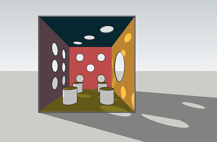
Well, we could have seen it coming, but seeing it didn’t stop my partner and I from procrastinating like crazy on our competition entry. When it came down to the final week we had made almost no progress on our original design: a dice shaped playhouse called the “Gamble House.” There was a sketchup model which we had both worked on at the end of our previous meeting, and it was pretty basic.

See what I mean? It’s literally a box. In the final “push” to get this thing submitted, I did what I learned to do in school in the final hour: stop designing and start producing. Since a design almost never feels complete or perfect, especially to the person designing, it’s important to know when to cut yourself off. I had lots of time to mess with the design, but such is procrastination. Now that the final week was upon us, there was only time to take whatever I had and try to make it look good.
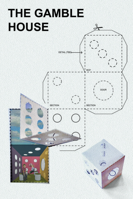
Now, I’m not super great at graphic design. I recognize that as a weakness of mine, but since the design is so simple, I wanted to make the presentation board a little more interesting. I came up with a clever way to display the project:

Since our dice box lends itself quite well to unfolding, I thought I could run with that. I would use the unfolded surface to display the sections, plans and perspective that are the bread and butter of architectural representation. I even took the idea a step further to attempt to add some interest to the board. I turned it into a hybrid-drawing. I literally printed the diagram out, cut out a section, then photographed it and brought it back into the computer. I quite like the effect.
The finished product looks admittedly disjointed, but, like I said, I’m not great at graphic design. I’m happy to have come up with something I think is clever, and I’m satisfied that we were able to see the competition through to submission. Unfortunately, we didn't make it to the next round of the competition (a much better dice house did though.)