I've been working on remaking my Interests Chart for a few weeks now. Rather than dragging out a series of updates for every time I work on it, I've decided to write down progress as I go, then bundle these updates all together.
UPDATE 1 (Day 2-6) | Update 2 (Day 7-9)
Here's what I have so far, and my log of how it's been going:
DAY 1
Take a look at my introductory post.DAY 2
After endlessly scouring the list of CSS and HTML components, I couldn't find what I was looking for: a way to incrementally select items within the hierarchy of the list. I looked at the <section>, <counter-increment>, and a plethora of selectors. Eventually, I began to accept that I was trying too hard to replicate java script functionality (specifically looping.) I also realized that attempting an immediate of the entire framework would be too much to take on all at once. Instead, I should start with a basic/simplified version. Maybe just a list with 1 level that selects and styles each <li> incrementally differently. That, I think, is my primary challenge.
DAY 3
I thought I'd reflect the hierarchy of the list by classing elements as parts of a plant, but I think I'm spending way too much time fretting about class names: is "limb" really a step above "branch"? can the "plant" class have multiple nested "trunk" classes? Clearly I was getting carried away. Also, it turns out I don't know how to apply javascript to html elements without using jQuery, so much for sticking solely to HTML/CSS. It seems prudent to make each level of the list identical ("branch" level should be organized the same as the "trunk" level, etc.)
DAY 4
It seems prudent to make each level of the list identical ("branch" level should be organized the same as the "trunk" level, etc.)Nearly started over just trying to get basic jQuery functions to run properly. As I build up from very basic (but working) script, I'm struck by how non-linear the process of coding is, which is ironic since it will execute so linearly...
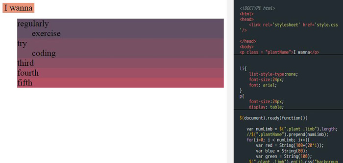
Success! I've recreated numbered lists with jQuery. I am a CODING GOD! </sarcasm>. Actually, that is a pretty good sign, it means Javascript is looping through the number of elements in a list and styling each one differently. With a little more effort I got the <li> to change background color incrementally, which is much more impressive visually

I took a moment to improve my workflow, clean up some extraneous pieces, and researched about "code playgrounds." After looking at a few, I was torn between JSFiddle and CSSDeck. While CSSDeck was the more attractive of the two, I settled on JSiddle for 3 reasons:
- It is one of the more widely used sandboxes, so it presumably has a good support network.
- It is seems to have more features and customization options.
- The embedding seems to offer at least slightly more functionality, which is important since I plan on embedding the project on my website.
DAY 5
After a brief hiatus, I'm back to it. The next issue I'm going to tackle is the background fill. So far, I've bee styling each individual list item <li>, which often contain nested lists. This means the whole container gets the background-color applied rather than just the area occupied by the text at the top. To solve this, I decide to wrap the text in a <p> which I point the styling towards.
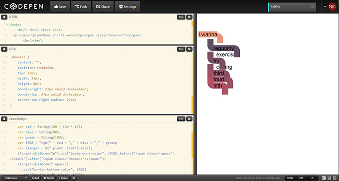
Now time to make those elbows that connect every level. Assisted by 2 gin highballs, I fumble my way through making shapes with CSS. I start with the downward arc, at the end of each statement, as the :after pseudo-element. When create an up arc as the :before pseudo-element of each <p>, I realized that alignment will start to be an issue. From what I remember while working through CodeAcademy, maybe Bootstrap is the way to handle alignments? Then again maybe not. After further research bootstrap is meant for "responsive" design. Since I don't know the ins-and-outs of how Bootstrap adjusts for different screens, maybe I'll put the alignment issue aside for now.
I decided to find a new code playground; I think JSFiddle's preview was reloading the page every time I updated, which was slowing down our lousy internet. After another look at the options, I think I prefer CodePen. It's cleaner, embeds quite well, and updates automatically without refreshing.
Hopefully I wont constantly be switching between playgrounds.
DAY 6
Today I'm tackling the coloring of the elbows. I learned that the pseudo-elements :before and :after are not accessible to Javascipt. This means I can't style them to match their respective element's colors. To solve this, I change those shapes to <span> elements on either side of the text box.
I'm beginning to understand how helpful it could be to adapt other people's code. Starting from scratch has it's merits, but it doesn't teach you how other people are solving similar problems. Besides, I spend such a HUGE amount of time searching the web, looking up every little thing I don't understand that starting from scratch makes coding into a grind.
Yay the elbows are working! I realize I can clean up the javascript by looking for repeated code and dropping that into a variable. Success so far. Next up I'll tackle that alignment issue...actually no, next I need to take a break and eat!

DAY 7
After a good long break, I'm back to working on this. I want to take care of alignments, but I'm trying to avoid using bootstrap. I debate about using a table to create the alignment, but read in a lot of places that you shouldn't use the table for layout purposes. I'm aware that bootstrap creates some kind of grid, but I wonder if I can recreate that grid with just plain CSS. That might mean eliminating the nested list structure of the html and the javascript is dependent on the count within that list. The trouble of leaving a project like this for too long is that when I get back into it, I want to rebuild everything from the ground up...
DAY 8
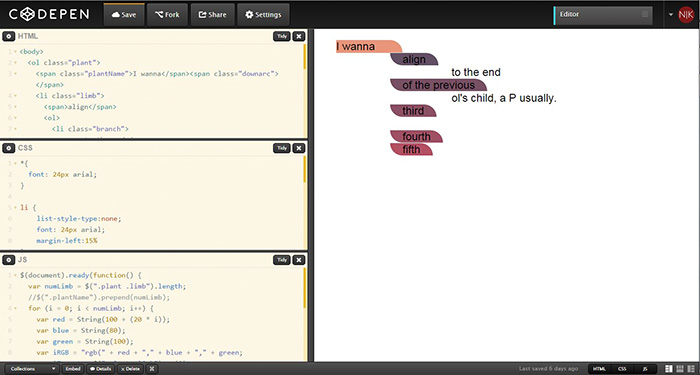
I've decided I was over thinking the alignment. Rather than trying to construct a grid and aligning my elements to that, I'm going to set the margin-left of certain elements to a set percentages (After looking for how to recreate the bootstrap grid in CSS, I think that's how it operates anyway.) I've also started pruning away code that doesn't seem to be doing anything. When you're troubleshooting constantly things get messy.

DAY 9
I'm becoming painfully aware how much time I spend on this and how incredibly slow it's going. Coding the graphic was supposed to make it faster to create and make changes! Oh the irony... I'm not sure what the next steps are, with the alignment issue solved things should start falling into place. I guess next I need a need a bar of variable height to connect levels together, which I'm trying to solve by extending the uparc object. Getting the list items to overlap is quite a challenge. I briefly toyed with restructure the HTML to nest each item within the item above it, but that doesn't really make much sense (to say nothing of rewriting most of the Javascript!)
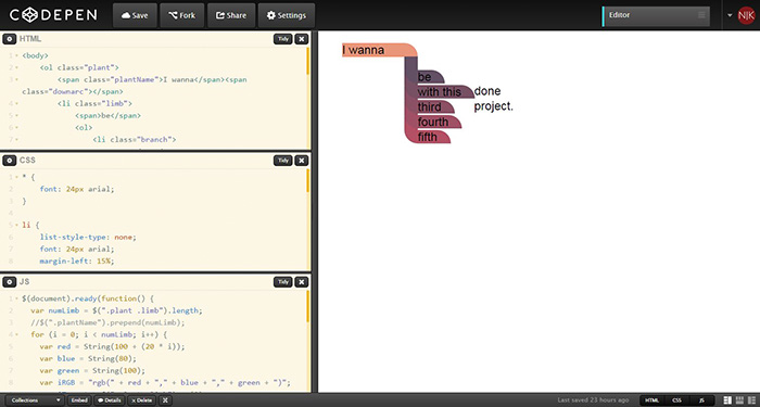
Once again, I do a short victory dance when I figure out a simple solution. Simply by setting a specific height of the containing element (<li> in this case), and adding the style float:left, I can force the containers to overlap as I want. There's a small issue with this solution: the lists with sub lists don't have their spacing taken into account, but I have an idea how to solve this with Javascript. I add a part to the script that changes the size of the container to reflect the number of items the list contains, but that doesn't seem to work. I also change the z-index of each arc to reverse the order in which they appear, and that at least seems to work.
I'm still working on explaining what I'm doing, so apologies if this is all gibberish. Suffice it to say, it's starting to look close to what I'm aiming for.
