There are a lot of things I wanna do, so many in fact that I sometimes lose track. When I started making a list of everything I'm interested in, a pattern started to emerge..
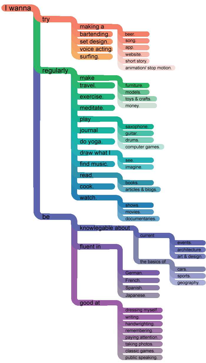
In the first post on this project, I talked about how I decided to organize this list, organizing interests by the words that precede them: I wanna try surfing. I wanna regularly travel. etc. I also wanted a graphic that laid it all out for me, and emphasized the continuous structure of each sentence that could be read. I settled on this graphic, and got to work laying it out in illustrator. Here it is:

A little about the making of....
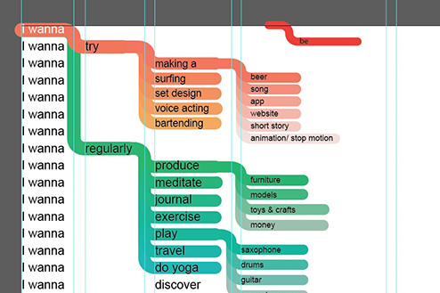
 I came up with the idea for the graphic almost immediately, but actually applying the concept to the content was a bit more complicated. For one, the list was way too long. I started with even spacing on every line, but the graphic became way too long.
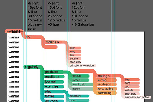
 Then I tried using a series of rules in place at each level that would govern the spacing, sizing, curve radii, and color shift. This system, at first applied universally, eventually had to be adapted differently to each section.
I'm pleased with the end result, but was less pleased with the workflow. I'm no illustrator wiz, so it took me several late nights to get everything done. By the time I finished, I realized there were things I wanted to add. I like the visual system I set up, and think the sentence based hierarchy is clever. If I continue the with the project, I'd like to find a way to automate the graphic somehow.