I'll take this as an opportunity to make some amendments to an old post I had about building a Sketchup model of an existing space. There are some strategies and best practices I'd like to dive into with greater detail.
Photos:
Take lots of photos of the space. In fact, take too many photos because as many photos as it feels like you take, I guarantee there will be some confusing dimension string, unclear alignment, or detail that you just can't quite remember. I speak from painful experience. No matter how simple the space or how detailed your drawings might be, you can't underestimate the value of systematically photographing the space you're trying to recreate. The systematic part is important, because of human bias. Designers are more guilty than anyone of viewing spaces predominantly from their photogenic sides. The tendency is to disproportionately photograph from these vantage points, which, ironically, already receive the most focus. Being systematic with how you document the space is the only sure way to minimize this attention bias.
A good method I use is to start with a few good overall views of the whole space, then systematically move around the room shooting every transition: corners, door-to-door, wall-to-ceiling, cabinet-to-wall, etc. Be sure to provide enough context in these views to always relocate them relative to the over all photos. Maybe a good check would be to imagine you're handing the photos to someone who's never seen the space and asking them to reconstruct it.
Layer management:
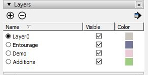 Few things drive me crazy quite like poor layer management. Unfortunately, since different modeling/drafting programs use the layers slightly differently, so there's no universal principle here. In Sketchup however, the main rule I'd stress is to ALWAYS keep base geometries on the default layer. By base geometry I mean the lines, reference lines, and planes that are the foundation for constructing objects, and by default layer, I'm referring to the
 Layer 0 built into every Sketchup model. See, Sketchup has a "feature" (annoying pointless nuisance) that base geometries stick together, so they need to be wrapped up in a group to act as distinct objects.
Another "feature" is that groups can have a different layer assignment than the base geometries within them. The extension of this "feature" is that interdependent geometries like a plane and the lines that create it can also be on different layers. Things can get out of control very quickly with trying to track down which layer contains a line for a plane on a different layer, which is in a group on a third layer. Avoid the problem all together: Keep base geometries on the default layer, create distinct objects by grouping the base geometries, and assign only the groups to layers. What layers you use will depend on your project. Some options might be existing-proposed, floors of a building, phases of construction, massing models-detailed entourage. My suggestion is to structure the layers around what would you like to turn off and on?
The model for heath used an existing/demo/proposed structure and had a layer for entourage. This last one is actually a very important detail when sharing a model with other users. The "bells and whistles" that make a model appear fully rendered are also the things that can drag a computer/videoprocessor to it's knees. Keeping all the "decorations" on a toggle-ready layer, can help the people who have to work with the model from spinning around a "heavy" model and waiting for their machines to catch up.
Scenes:
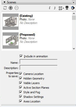 When combined with good layer management, using Sketchups scenes can be a powerful tool. The primary function is save the camera's particular vantage point, which is useful in it's own. However, if you toggle the Show Details there are more interesting options for how a scene can be used. One of my favorite tricks is to set specific scenes for the layers I want to toggle. This can save lots of clicks when toggling a complex combination of layers, say for multiple stories or different material type layers. Of course this can also apply to the hidden geometry options and the section tools. The bar of scene tabs across the top of the window can suddenly become a nifty little row of buttons to quickly get to the view you want.
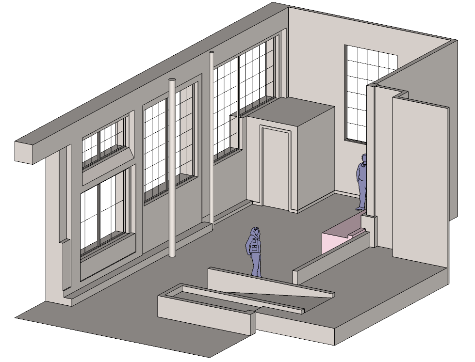
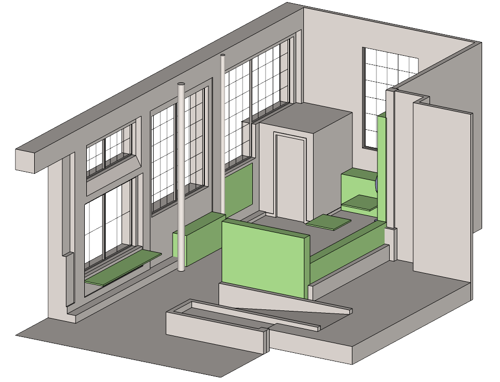
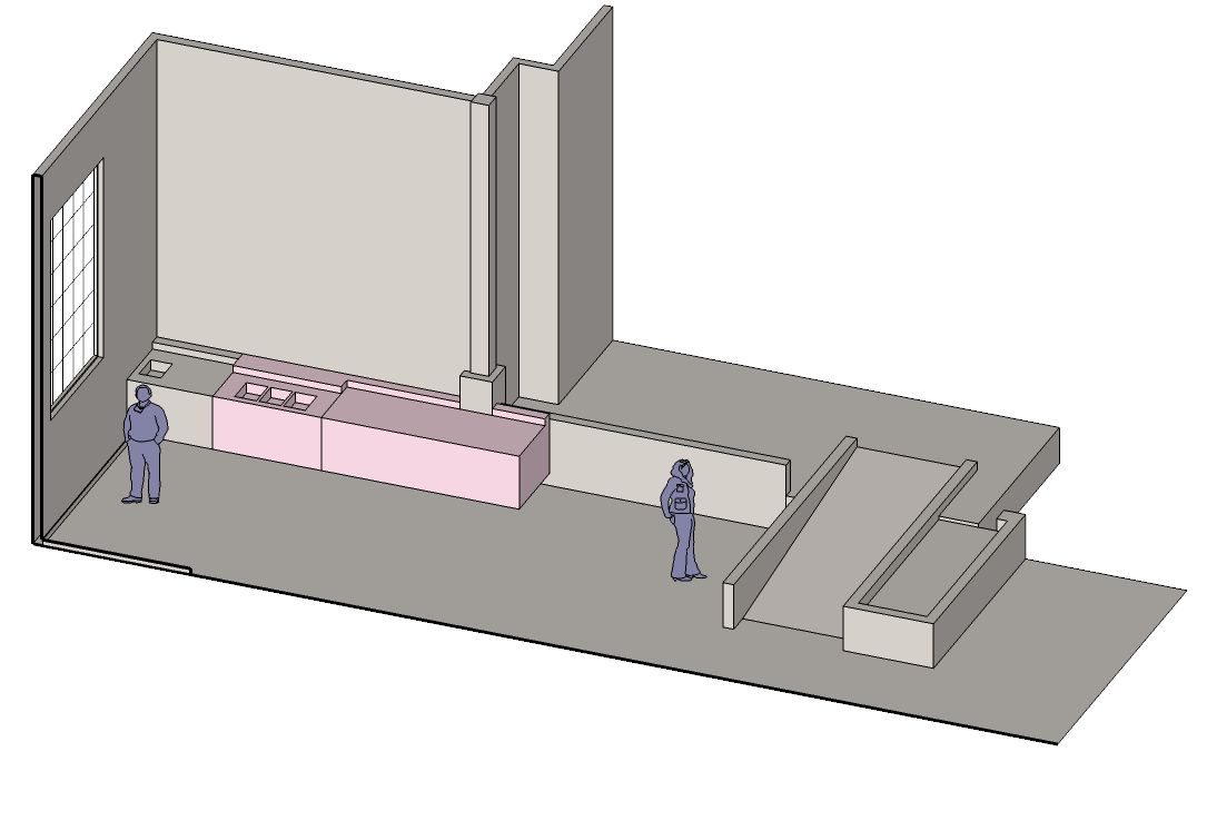
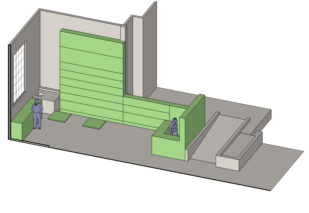
Here are the different views and layers states I set up in the model. There's a view of the overall space, and a view looking at the main wall. Scene 2 had a bit of background clutter, so I cleaned that up with a section, which I then hid in the both scenes. I had been part of the charrette pulled together to bounce ideas around, so I had a good sense of where the design was at. I threw in some massing models of the basic design features to give the project designer some basic building blocks to start with. Lastly, for scale I added an "entourage" layer with the stock sketchup people. One actual useful feature is the ability to assign colors to certain layers and then select "color by layer" in the layer pallet drop down.


