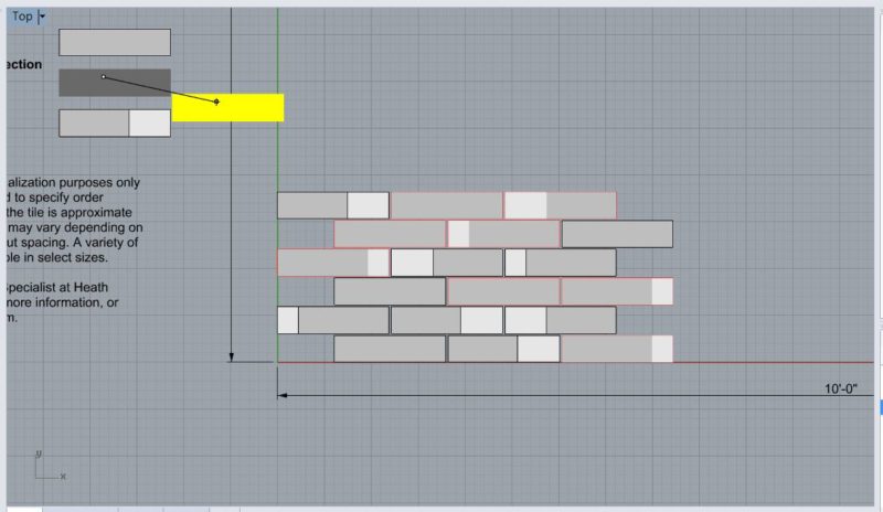
I've been continuing my drafting work for Heath Ceramics, and it's gotten more complex than simple running and stacked bonds I'd previously worked on for the Field Collection. One of Heath's many strong suits is the refined color pallet of their glazes, which the next few collections showcase in 2 distinct ways. Both Mural and Dual-Glaze use a pre-selected combination of colors. It helps keep a certain degree of quality control over design, but also keeps their inventory manageable.
With Dual Glaze tiles, the combinations of colors occurs on the tile themselves. As the name implies, there are 2 glazes on each tile with varying proportions of each glaze. We'd decided early on, however, that rather than trying to represent each of the several color combinations offered by Heath that a grey tone representation would suffice to demonstrate the patterns created by colors. Rather than being a random thing, the patterns are actually pre-set design as well. My task was to translate that pattern from the diagram in their specification to a large repeated across the multiple size tiles offered with Dual Glaze. Within each of the sizes, were two options for patterns with a 3-tile mix and 6-tile mix with their own distinct pattern. With so much complexity, a shared google spreadsheet has been incredibly useful for keeping all the information sorted out.

My process for drawing was as linear as possible, if perhaps a little tedious. After doing a first arrangement of the pattern based on the guiding diagram, I scaled this diagram to match the size tile I was working on. I then created blocks of each of the 3 or 6 different color combinations. With these blocks made, I would copy, rotate, and place each block in the appropriate place within the template diagram (outlined in red to show me what I had and hadn't done.) I'd then double check the arrangement by moving out the template from "under" the blocks and do a line by line verification.


After doing this with both the 3 and 6 tile mixes, I'd turn both on simultaneously to do a visual check for consistency against each other. Since I was scaling the arrangement first, this had the unfortunate affect of scaling the grout lines as well. After re-spacing all of the grout to exactly 1/8", the two different mixes matched up much more consistently. I then grouped each module together and started tessellating, trimming off anything that hung outside the 10' x 10' boundary.
The Mural Collection takes a different approach: rather than pairing colors on the same tile, it seems to group them into little triads (what I came to think as "cubes.") Heath's design for this pattern is based on the repetition of one, long continuous module. There are pre-detirmined color combinations here as well, but rather only 2 colors, the Mural collection utilizes 6 different colors in any of different pallets. Thankfully, I was again only doing grey-scale. With a wider spectrum of colors, I followed the lead of the diagram by labeling each block by letter rather than trying to keep one grey straight from another. Working from right to left, I again snapped each block into a placeholder template.
